Recently, the TCG team participated in a data visualization challenge at the Indy Big Data Conference, inspiring me to write a blog on becoming data literate. What does it mean to be data literate? Merriam-Webster defines literacy as “having knowledge or competence,” and being data literate is a crucial skill for navigating our big data era.
Now, you don’t have to love math or know how to write code to be data literate. You need to be comfortable asking what, how, why, and so what of data.
- What data is being collected? (e.g., age, county, number of individuals with a college degree)
- How is the data being collected? (e.g., application, agency records, census survey)
- Why? Be bold and ask why, especially when it comes to data analysis. (e.g., Why did you focus on this subset of the population? Why were those data points analyzed?)
- So what? (e.g., How does the number of individuals without a college degree impact our strategy to address this issue?)
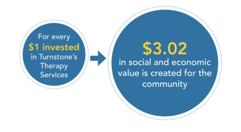
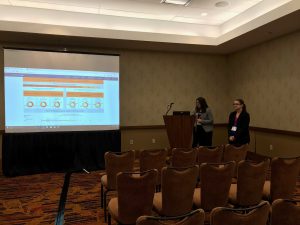
For TCG’s presentation (check it out here), we reviewed multiple datasets the Indiana Management Performance Hub provided. We had to learn what each variable meant, how the values were determined or collected, and why those variables were important to those data sources. Figuring out the data intended to learn about workforce development measures and industry codes. Analysis of the data involved selecting certain data to focus on and incorporating different views and additional data to answer the questions we had. Listing our recommendations answered the “so what” for the data we chose to analyze and present.
 Data literacy is very important to the data visualization world as well. Before making the data “pretty” with charts or data visualization software (like Tableau, which we featured in this blog), you must know your data and metrics. That way, when you see your dashboard or charts showing 1,000 current donors with a 25% retention rate from last year, you will know if that is correct. Programs like Tableau (which imports your data to visualize) can’t tell you if you’re creating the correct chart with the right variables. It takes the same level of critical thinking applied to the data.
Common Mistakes with Data Visualization:
- Not spot-checking data to ensure things are correct (such as population totals).
- Too much data. More is not always better, and lots of data can be overwhelming and may detract from the analysis’s goal.
- Selecting the wrong variables. A chart can be created to compare apples to oranges, but it may not be of any value.
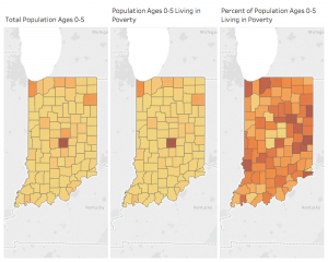
- Not using percentages when comparing groups with different totals. This is one I see quite often and is a reminder to always question data. In the example below, Marion County (center of map) looks like it has the most young children and the most young children in poverty because Marion County has the largest population. If you look at the percent of young children in poverty, other counties show just as high of a percentage as Marion County.
- Lack of context. Without knowing the source of the data or data totals, the statistics may be less convincing. Industry knowledge is also important to context in order to visualize the most valuable data and answer “So what?”
How comfortable are you with data? Start with your own! Ask questions and see what you can uncover. Check out some of our favorite sources of data that can add to your analysis. As you dig in, Transform Consulting Group is ready to assist with our evaluation, research, strategic planning services, data visualization training, and products. Contact us today to ask questions and learn more!